Exploring US SAT scores
I took a look at SAT score summaries by US state. I found that there is a lot of variation in the proportion of students in each state who take the SAT test, and also correlations between that rate and the testing scores. Finally, I made some choropleths to visualize the spatial distribution of scores across the country.
1. What does the data describe?
The data describe the SAT test taking rate and scores for students in each state.
2. Does the data look complete? Are there any obvious issues with the observations?
The data appear complete at first glance. There are no empty values, rates outside the range [0,100] or scores outside the range[0,800]. All the states and DC are accounted for, along with a titles row and a summary row for the students across the whole country.
3. Create a data dictionary for the dataset.
- State: Two letter abbreviation of state name (and DC)
- Rate: Percentage of students in the state who took the SAT exam: range 0-100
- Verbal: Verbal portion of SAT score: range 0-800
- Math: Math portion of SAT score: range 0-800
4. Load the data into a list of lists
with open("../assets/sat_scores.csv", 'r') as f:
    reader = csv.reader(f)
    rows = [x for x in reader]
print len(rows)
rows
53


[['State', 'Rate', 'Verbal', 'Math'],
 ['CT', '82', '509', '510'],
 ['NJ', '81', '499', '513'],
 ['MA', '79', '511', '515'],
 ['NY', '77', '495', '505'],
 ['NH', '72', '520', '516'],
 ['RI', '71', '501', '499'],
 ['PA', '71', '500', '499'],
 ['VT', '69', '511', '506'],
 ['ME', '69', '506', '500'],
 ['VA', '68', '510', '501'],
 ['DE', '67', '501', '499'],
 ['MD', '65', '508', '510'],
 ['NC', '65', '493', '499'],
 ['GA', '63', '491', '489'],
 ['IN', '60', '499', '501'],
 ['SC', '57', '486', '488'],
 ['DC', '56', '482', '474'],
 ['OR', '55', '526', '526'],
 ['FL', '54', '498', '499'],
 ['WA', '53', '527', '527'],
 ['TX', '53', '493', '499'],
 ['HI', '52', '485', '515'],
 ['AK', '51', '514', '510'],
 ['CA', '51', '498', '517'],
 ['AZ', '34', '523', '525'],
 ['NV', '33', '509', '515'],
 ['CO', '31', '539', '542'],
 ['OH', '26', '534', '439'],
 ['MT', '23', '539', '539'],
 ['WV', '18', '527', '512'],
 ['ID', '17', '543', '542'],
 ['TN', '13', '562', '553'],
 ['NM', '13', '551', '542'],
 ['IL', '12', '576', '589'],
 ['KY', '12', '550', '550'],
 ['WY', '11', '547', '545'],
 ['MI', '11', '561', '572'],
 ['MN', '9', '580', '589'],
 ['KS', '9', '577', '580'],
 ['AL', '9', '559', '554'],
 ['NE', '8', '562', '568'],
 ['OK', '8', '567', '561'],
 ['MO', '8', '577', '577'],
 ['LA', '7', '564', '562'],
 ['WI', '6', '584', '596'],
 ['AR', '6', '562', '550'],
 ['UT', '5', '575', '570'],
 ['IA', '5', '593', '603'],
 ['SD', '4', '577', '582'],
 ['ND', '4', '592', '599'],
 ['MS', '4', '566', '551'],
 ['All', '45', '506', '514']]
6. Extract a list of the labels from the data, and remove them from the data.
labels = rows[0]
data = rows[1:-1]  # cut row 0 labels and last row summary
7. Create a list of State names extracted from the data. (Hint: use the list of labels to index on the State column)
state_names = [x[0] for x in data]
8. Print the types of each column
for x in data[0]:
    print type(x)
<type 'str'>
<type 'str'>
<type 'str'>
<type 'str'>
9. Do any types need to be reassigned? If so, go ahead and do it.
data = [ [x[0],int(x[1]),int(x[2]),int(x[3])] for x in data]
10. Create a dictionary for each column mapping the State to its respective value for that column.
data_rate = {x[0]:x[1] for x in data}
data_verbal = {x[0]:x[2] for x in data}
data_math = {x[0]:x[3] for x in data}
11. Create a dictionary with the values for each of the numeric columns
data_dict = {col:[x[i] for x in data] for i,col in enumerate(labels)}
12. Print the min and max of each column
print "Rate:",min(data_dict["Rate"]), "-", max(data_dict["Rate"]), "mean:",sum(data_dict["Rate"])/len(data_dict["Rate"])
print "Verbal:",min(data_dict["Verbal"]), "-", max(data_dict["Verbal"]), "mean:",sum(data_dict["Verbal"])/len(data_dict["Verbal"])
print "Math:",min(data_dict["Math"]), "-", max(data_dict["Math"]), "mean:",sum(data_dict["Math"])/len(data_dict["Math"])
Rate: 4 - 82 mean: 37
Verbal: 482 - 593 mean: 532
Math: 439 - 603 mean: 531
13. Write a function using only list comprehensions, no loops, to compute Standard Deviation. Print the Standard Deviation of each numeric column.
def stddev(data_list):
    n = len(data_list)
    mean = sum(data_list)/n
    sum_dev_sq = sum([(x-mean)**2 for x in data_list])
    return (sum_dev_sq/float(n))**0.5

print "Rate:", round(stddev(data_dict["Rate"]),2)
print "Verbal:", round(stddev(data_dict["Verbal"]),2)
print "Math:", round(stddev(data_dict["Math"]),2)
Rate: 27.28
Verbal: 33.04
Math: 35.94
Step 4: Visualize the data
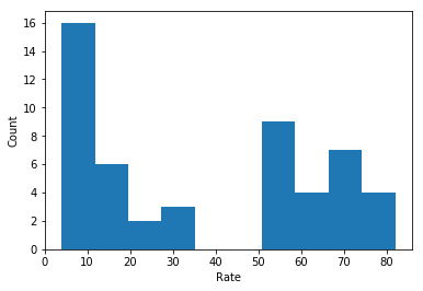
14. Using MatPlotLib and PyPlot, plot the distribution of the Rate using histograms.
plt.hist(data_dict["Rate"])
plt.xlabel("Rate")
plt.ylabel("Count")
plt.show()
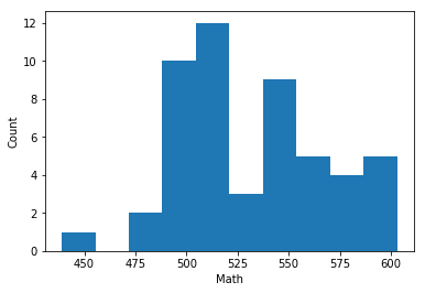
15. Plot the Math distribution
plt.hist(data_dict["Math"])
plt.xlabel("Math")
plt.ylabel("Count")
plt.show()
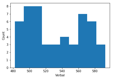
16. Plot the Verbal distribution
plt.hist(data_dict["Verbal"])
plt.xlabel("Verbal")
plt.ylabel("Count")
plt.show()
17. What is the typical assumption for data distribution?
The typical assumption for a data set is that the distribution is similar to the normal distrinution (or bell curve).
18. Does that distribution hold true for our data?
Not really, no. The variables all have a valley in the center, where the normal distribution is at its maximum value.
19. Plot some scatterplots. BONUS: Use a PyPlot figure to present multiple plots at once.
fig, axes = plt.subplots(3,1, figsize = (10,10))
fig.subplots_adjust(wspace = 0.25, hspace = 0.25)


axes[0].scatter(data_dict["Rate"],data_dict["Math"])
axes[0].set_xlabel("Rate")
axes[0].set_ylabel("Math Score")
axes[1].scatter(data_dict["Rate"],data_dict["Verbal"])
axes[1].set_xlabel("Rate")
axes[1].set_ylabel("Verbal Score")
axes[2].scatter(data_dict["Verbal"],data_dict["Math"])
axes[2].set_xlabel("Verbal Score")
axes[2].set_ylabel("Math Score");
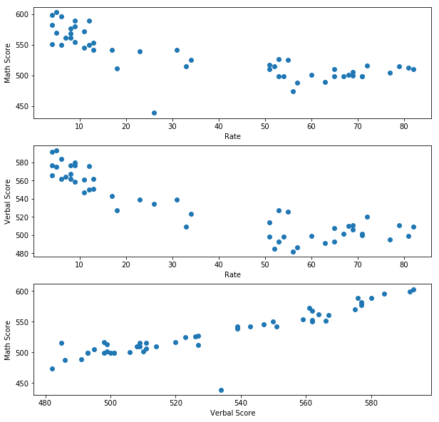
20. Are there any interesting relationships to note?
There is a strong negative correlation between test taking Rate and both Math and Verbal scores. This is likely due to the smartest or most ambitious students self selecting to take the SAT test for college applications where it is not required.
There is also a positive correlation between Math and verbal scores, indicating that students are likely to do well or worse in both categories together. The test is better at selecting good students in general rather than differentiating on a specific subject skill set.
There is also one outlier: OH, where the Math score is much lower than the Verbal score would suggest it should be.
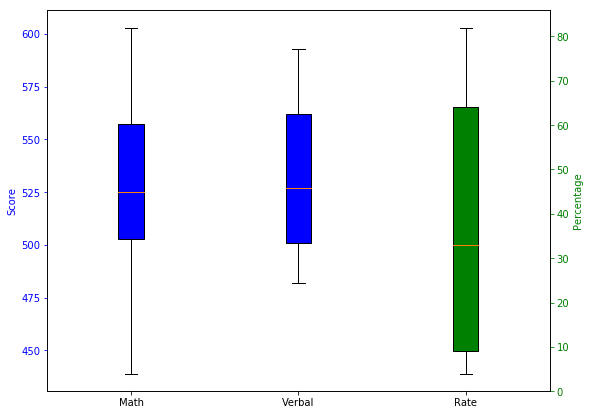
21. Create box plots for each variable.
fig, ax = plt.subplots(figsize=(9, 7))

plot_data = [data_dict["Math"], data_dict["Verbal"]]
bp1 = ax.boxplot(plot_data,patch_artist=True)
ax2 = ax.twinx()
bp2 = ax2.boxplot(data_dict["Rate"], positions=[3],patch_artist=True)
ax.set_xlim(0.5, 3.5)

#top=600
x = [1, 2, 3]
boxColors = ['b', 'b', 'r']
ticklabels = ["Math", "Verbal", "Rate"]
ax.set_ylabel('Score', color='b')
ax.tick_params('y', colors='b')
ax2.set_ylabel('Percentage', color='g')
ax2.tick_params('y', colors='g')

plt.xticks(x, ticklabels)

for bplot in (bp1,):
    for patch in bplot['boxes']:
        patch.set_facecolor('b')

for bplot in (bp2,):
    for patch in bplot['boxes']:
        patch.set_facecolor('g')


#plt.setp(ticklabels)

plt.show()
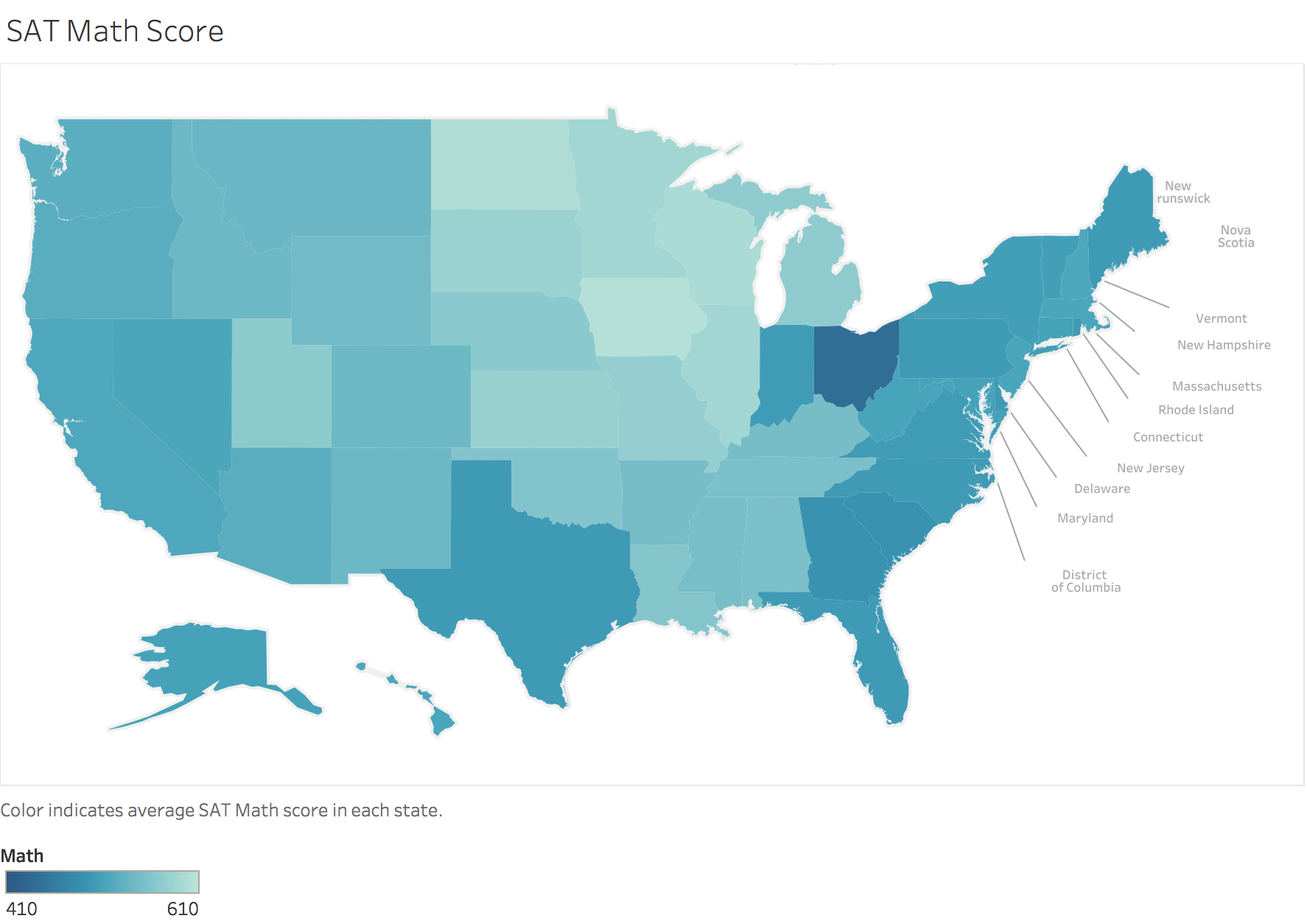
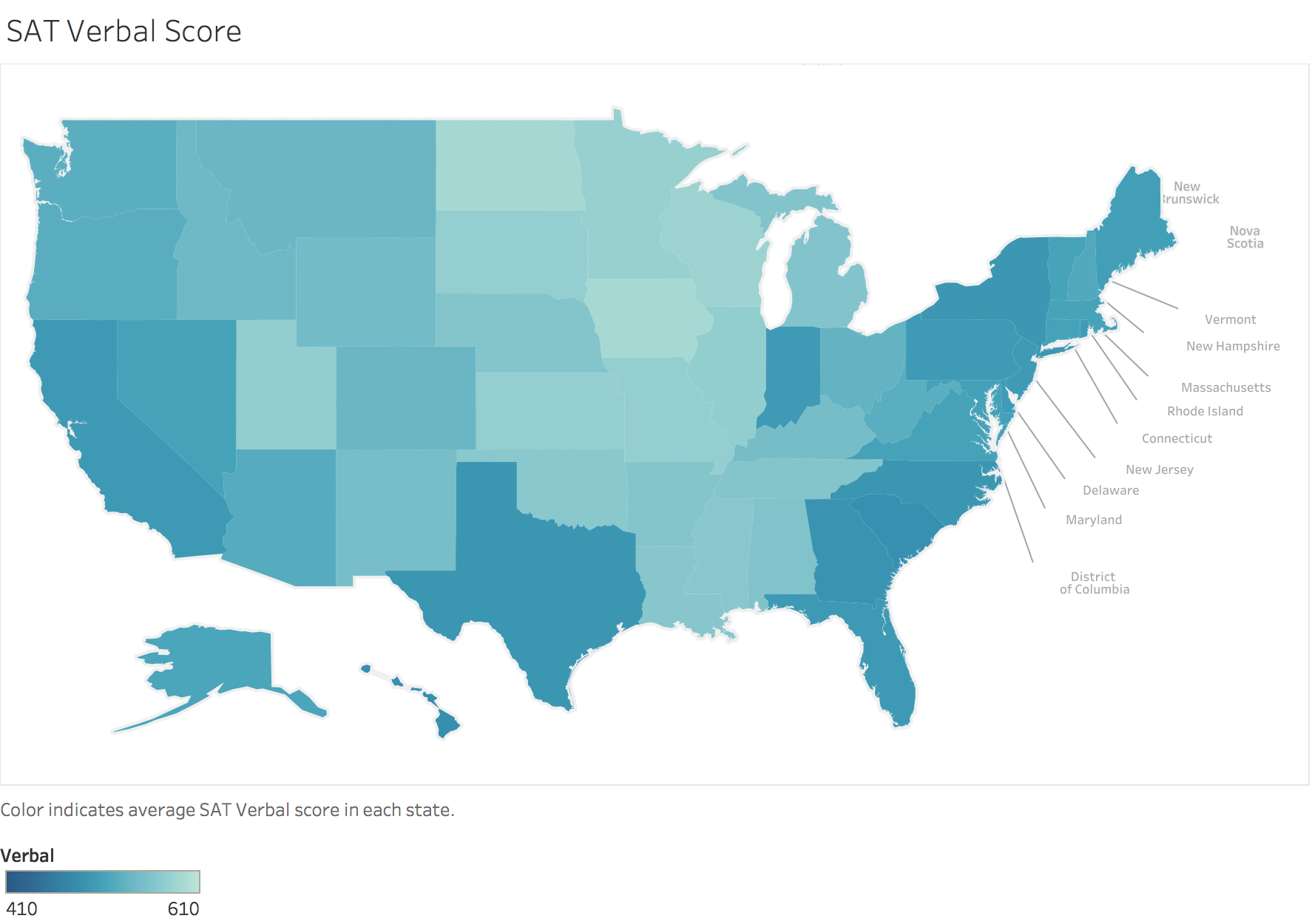
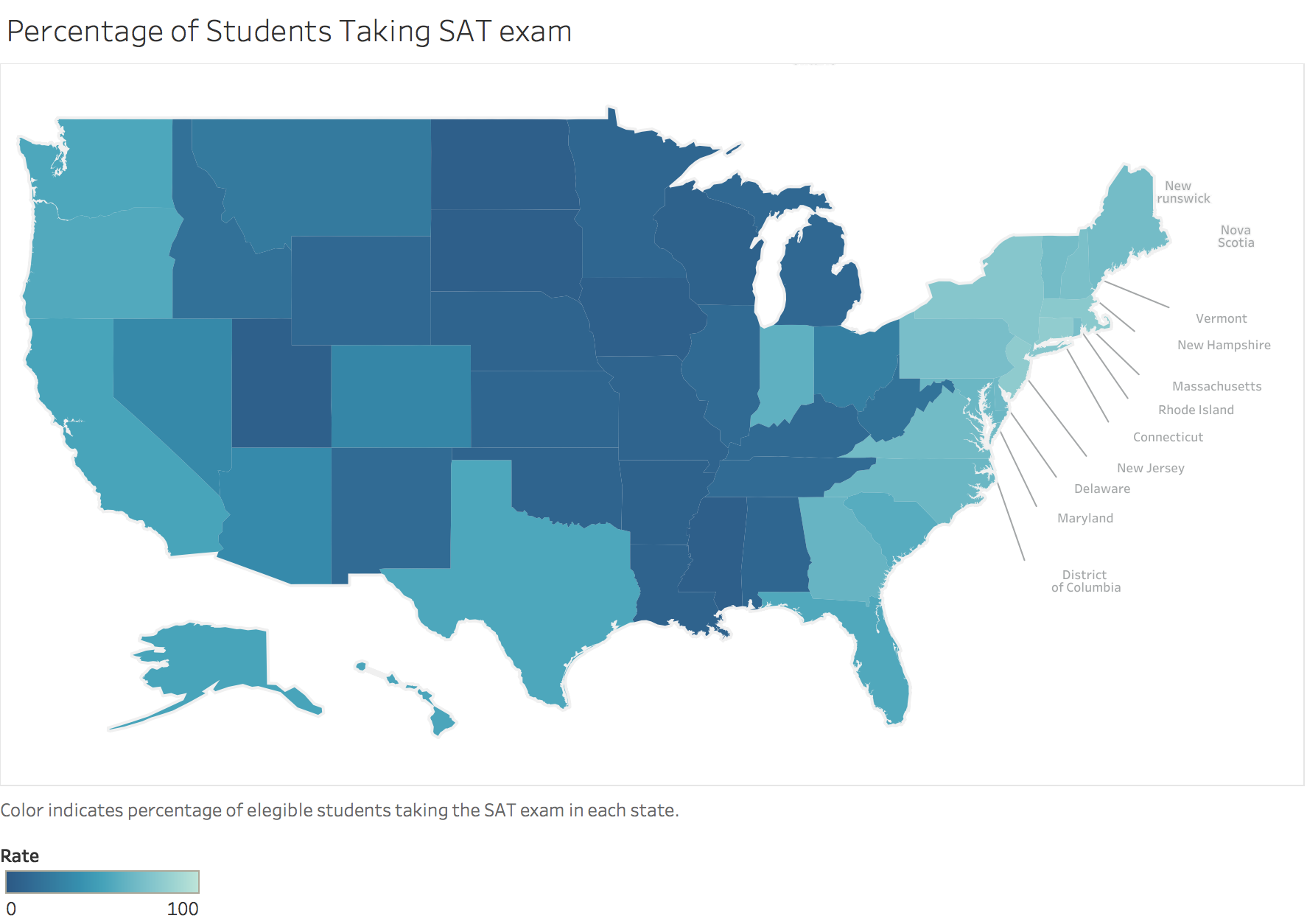
BONUS: Using Tableau, create a heat map for each variable using a map of the US.