Bilboard top music chart analysis
Recently, I took a look at the Billboard top 100 most popular songs from the year 2000. The bulk of this dataset was a series of columns containing each song’s rank in the charts each week after it entered. In the process of cleaning this up and condensing the data into a single column, I came across some interesting trajectory templates: “fads,” “smash hits,” and “resurgent hits.”
As with any project, I followed these steps during my analysis:
- Understand the structure of your data set
- Clean and transform your data set
- Explore the data and form hypotheses
- Conduct the analysis
- Create final visualizations
I am approaching this dataset from the mindset of a manager of an up and coming band. I want to be able to advise them about how different genres perform in the charts. Most notably, I am interested in both the peak ranking and the number of weeks tracks stay in the charts. The success of a track requires a combination of these factors.
1. Data structure
This dataset has 317 entries with 83 columns of data. The first seven columns give the usual details about the track: the year (which happens to be 2000 for every entry in this list), the artist name, track name, track length, and musical genre. Next come the data columns describing each track’s performance in the Billboard charts: the date each track first appeared on the chart, and the date each track peaked (reached its highest ranking), followed 76 columns storing each track’s ranking for each week since it first entered the chart.
I did not question how any of these fields were filled, but simply charted the data as it appeared, while also doing a simple sanity check by researching a couple of the most popular songs of the year to verify my analysis of the data matched their actual performance. Consider Breathe by Faith Hill, for example: I correctly identified Breathe as a massively popular song, but the genre is listed as Rap…. though I would have considered it Country. I see this exercise as vindication that I can correctly interpret the most important aspect of the data (i.e. the rankings), and also as a cautionary note about blindly trusting data read from any table.
2. Data cleaning and transformation
At first glance, this dataset seemed remarkably complete. Nearly every column was listed as completely full, and I thought just some simple type conversions and summarization would be required. Careful reading of the df.info() result showed some issues starting around week 25:
x24th.week         317 non-null object
x25th.week         39 non-null object
x26th.week         37 non-null object
x27th.week         30 non-null object
x28th.week         317 non-null object
Amidst the dozens of completely full columns lie three nearly empty ones!! Further exploration showed that weeks 25-27 included null (np.NaN) values for entries where the track was not on the charts during that week, while all the others used asterisks (*). A simple lambda function applied to all cells in the table converted all the columns to use the null value format.
With all the weekly ranking columns in a suitable format, I was able to summarize the rankings into a single column containing a tuple of the rankings, and then count the total number of weeks the track appeared on the charts. I used lambda functions again to add these columns to the dataframe (note that I replaced the null values with 101 to make plotting easier), and then I dropped the 76 columns I wouldn’t be needing anymore:
df = df.applymap(lambda x: np.NaN if x=='*' else x)
df['week_list'] = df.iloc[:,7:].apply(lambda x: tuple([int(i) if i==i else 101 for i in x ]), axis=1)
df['weeks_on_list'] = df['week_list'].apply(lambda x: len([i for i in x if i<101]))
df = df.drop(df.columns[8:83], axis=1)
This cleaning and summarization process had the benefit of converting all the data into integers that would be easy to plot. Now I just needed to convert the columns holding dates and times into a suitable format for plotting as well. Luckily, the pd.to_datetime function was able to convert my track length, date entered and date peaked columns very easily. The resulting datetime objects can be reformatted into any suitable format later, as required.
I noticed that my genres column had some values that should be grouped together. I cleaned them up with the following lambda functions to combine Rock with Rock'n'Roll and R & B with R&B:
df['genre'] = df['genre'].apply(lambda x: 'Rock' if x=="Rock'n'roll" else x)
df['genre'] = df['genre'].apply(lambda x: 'R & B' if x=='R&B' else x)
I now had rankings for each week, the total number of weeks spent on the charts, and the track genres cleaned up and ready for analysis. I’m actually interested in combining the ranking and duration of each track to get a sense of its overall popularity. For this, I created a function to combine those two aspects of each tracks performance into a score value that I store as a new column:
def scoring(series):
    """Create a song score based on time spent at each rank in the list"""
    score = 0
    for i in series:
        if i < 10:
            score += 10
        elif i < 20:
            score += 9
        elif i < 30:
            score += 8
        elif i < 40:
            score +=7
        elif i < 50:
            score += 6
        elif i < 60:
            score += 5
        elif i < 70:
            score += 4
        elif i < 80:
            score += 3
        elif i < 90:
            score += 2
        elif i < 100:
            score += 1
    return score

df['score'] = df['week_list'].apply(scoring)
3. Data exploration and hypothesis iteration
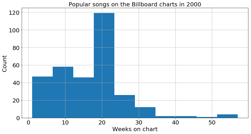
The first step to exploration is to pick a variable and look at its plot, so I did a histogram of the number of weeks spent on the chart. One can clearly see that many songs fall off the charts about 20 weeks after they enter. Additionally, the distribution is weighted towards shorter durations, with just a few songs lasting significantly longer than the median (around 20).
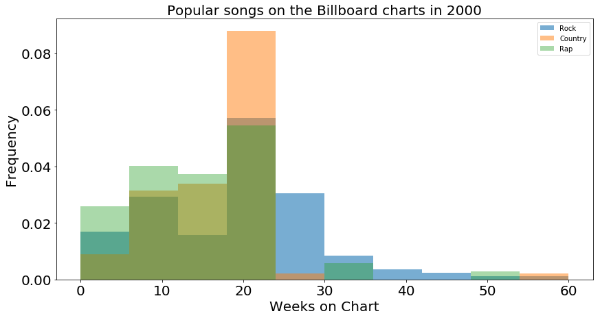
This chart is great for a general overview of the trends for a general track, but I’d like to get more detailed information about the individual genres. To this end, I made another histogram where I plot the distribution of the three biggest genres: Rock, Country, and Rap. I normalized the histogram by dividing height of each distribution by the number of entries, converting the counts into probabilities or frequencies. This chart quickly becomes confusing to read with too mych information overlapped on top of each other, but it appears that the Country and Rock (orange and blue) charts have a taller peak at 20 weeks than Rap does, and that Rock has the most prominent tail stretching out past 20 weeks.
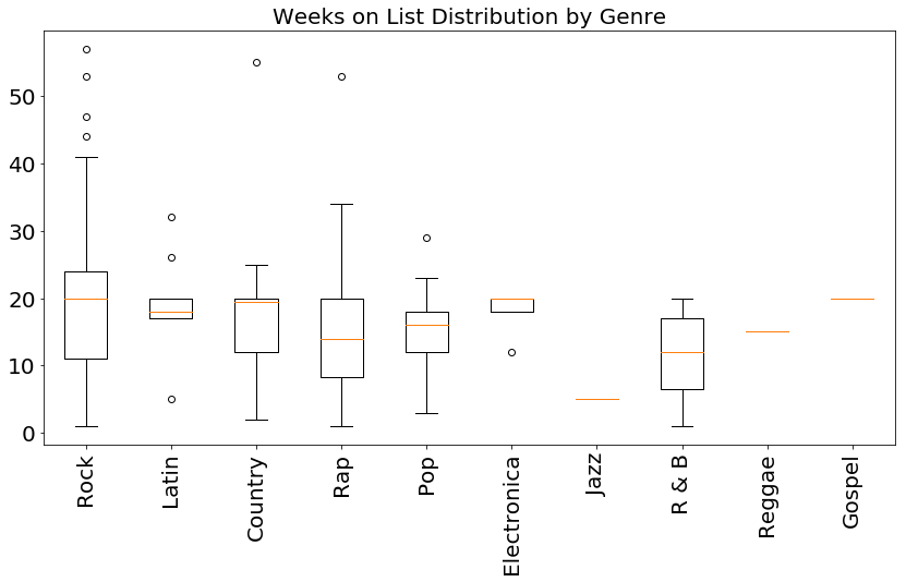
This muddy situation is clarified by using a series of boxplots (one for each genre). We lose some information (namely how severely peaked the data is at 20 weeks), but we gain more clarity in the relative widths of each distribution, and more clearly see the median values stacking up. In particular, I notice that although Rock and Country have very similar medians and Q1 boundaries, the Country distribution has almost no entries above the median value (Q3 is very close to the median), while the Rock distribution stretched much higher above the median value. This lead me to my first hypothesis:
Do Rock songs spend more time on the charts, on average, than Country songs?
Before I go too far down this analysis path, I don’t want to forget about considering the total rank of each song, in addition to how long it stays on the charts. I am also interested in finding songs that might have spent 2 months in the top 10 in addiiton to songs that were on the chart for 6 months but never break into the top 40. To this end, I plotted the rank of each song over time, lining up their starting dates so that I can compare their trajectories. Again, I also color coded songs by genre for the biggest three genres.
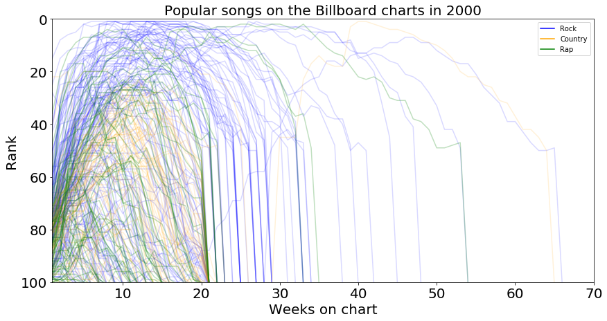
Looking at the trajectories, we can see that most songs run their entire course in the first 20 weeks. Popping onto the charts around position 75 in their first week, steadily climbing to a peak around week 12 and dropping off by week 20. There are more Rock songs climbing to the top of the charts, but it is decidedly mixed between the genres in the first 20 weeks. Looking at the wider arcs, we again see more Rock songs, but this is largely due to their prevalence in the data set. We also see Rap and Country songs having long term success, and the density is such that we can follow individual lines. It seems like perhaps the genres have a little more spread when both time and rank are considered.
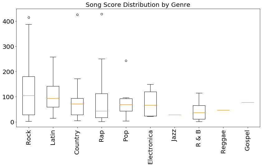
To study this more closely, I made another set of box plots for the score distributions by genre. Clearly the hits are spread among the genres, with every genre with more than 5 entries in the table having at least one smash hit with a score over 300. To get a better sense of how good these scores are, I can plot a histogram of their distribution over all genres:
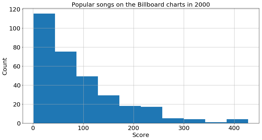
One can see that most scores are below 100, so scores over 200 are quite rare, and over 300 is a candidate for best song of the year! Going back to the boxplot of scores, one can see that most of the songs in the good gategory (i.e. scores between 100 to 200) fall into the Rock and Latin genres, though most genres have at least one big hit (over 250). This leads me to my second question to investigate:
Do Rock songs recieve higher scores, on average, than Country songs?
To test my hypotheses, I will set up 2-sample t-tests with a level of significance of 5%. I need to carefully consider the results because I set up my hypotheses to be 1-tailed tests, while the SciPy analyses return 2-tailed results by default.
4. Run the tests
Actually running the t-tests is very simple: simply run the ttest packages from the SciPy stats module. I use the ttest_ind method because I have two samples with independent scores (i.e. the Rock score and the Country score are not correlated). I also made sure to explicity say that the vairance of my samples are not the same so they will be calculated from the data.
tstat1, pval1 = stats.ttest_ind(a= df[df['genre']=='Rock']['score'],
                b= df[df['genre']=='Country']['score'],
                equal_var=False)
tstat2, pval2 = stats.ttest_ind(a= df[df['genre']=='Rock']['weeks_on_list'],
                b= df[df['genre']=='Country']['weeks_on_list'],
                equal_var=False)
alpha = 0.05
print "Do Pop songs get a higher score than Country songs?"
print pval1*2 < alpha
print "Do Pop songs stay on the charts longer than Country songs?"
print 2 * pval2 < alpha
This section of code returns:
Do Pop songs get a higher score than Country songs?
True
Do Pop songs stay on the charts longer than Country songs?
False
There is no statistically significant evidence that Rock songs stay on the charts longer that Country songs, but there is evidence that Rock songs recieve higher scores than Country tracks.
5. Final visualizations
This section was largely completed before the last two, as I used those final plots earlier in this post. There were a couple additional stories in the data that I wanted to point out.
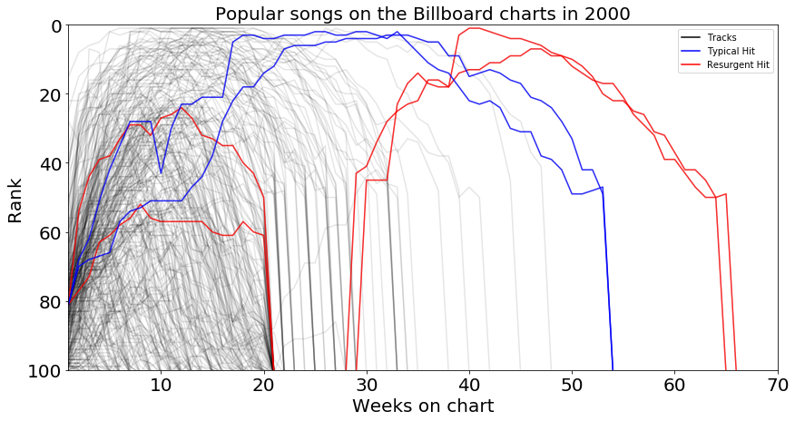
I noticed a phenomena I’m calling “fad tracks” for songs which enter the charts in the top 25, but then quickly fade away and fall off the rankings. This is different from “smash hits” which start out in the top 25, but then stay there for 20 weeks or more, often staying on the charts longer than songs with a traditional rise to popularity (i.e. entering the charts below rank 60). This Time Around by Hanson and Crybaby by Mariah Carey are examples of fad tracks (seen in red below), while Maria, Maria by Santana and There U Go by Pink are smash hits (seen in blue).
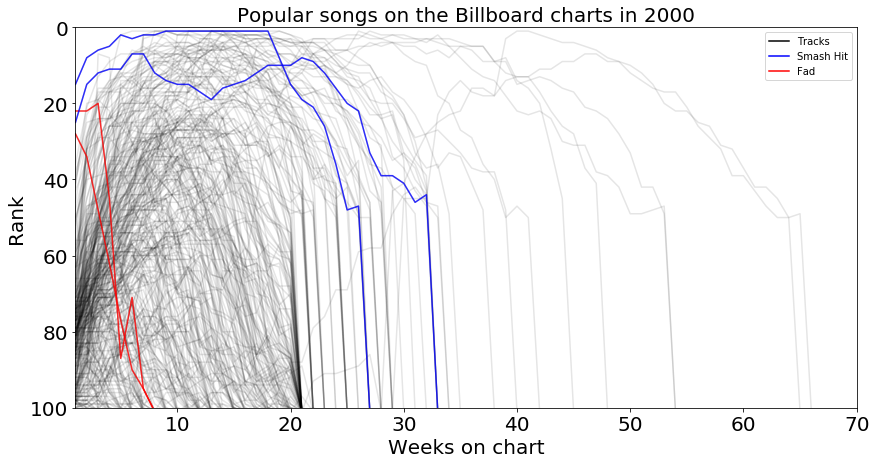
Finally, I wanted to point out some interesting tidbits about the opposite of a fad track: that is a track that runs the typical course of entering the charts somewhere lower down and peaking before falling off the charts around week 20, but then sees a resurgence of popularity and storms back onto up up to the top of the charts after a dozen weeks off! Amazed by Lonestar and Higher by Creed are examples of resurgent tracks seen in red below. There are also traditional hits that just rule the charts for weeks on end during the year. Two examples are Breathe by Faith Hill and Kryptonite by 3 Doors Down, which are shown in blue below.