
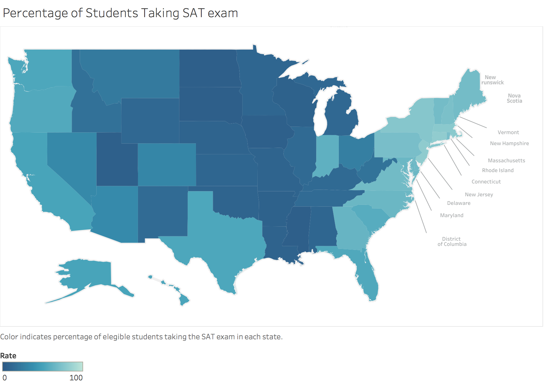
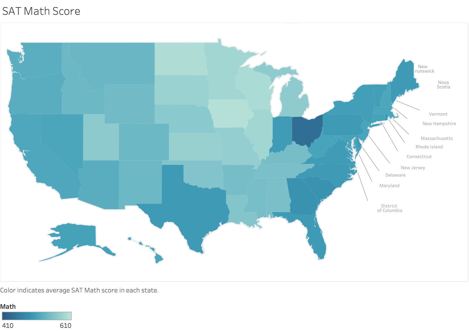
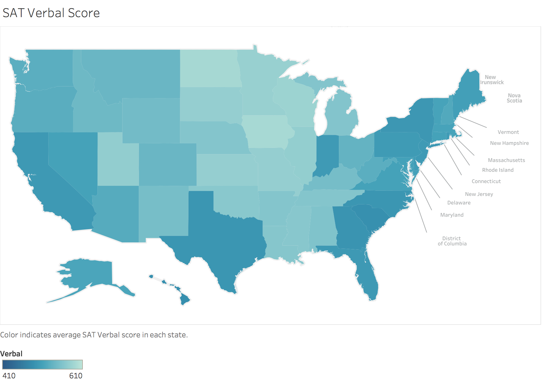
Custom choropleths in Tableau
We worked with some data about SAT scores and test taking rates in every state over the last week. I was able to use Tableau with some custom mapping options to keep the image looking professional.
I found a file defining polygons for each state at Tableau Mapping. I was able to follow the directions from a tutorial by Steve Batt which basically say:
- Open the saved map file from Tableau Mapping
- Add a new connection with your current data to be mapped
- Ensure the two data sets are joined properly (i.e. State ID from the map matches a column in the new data) by clicking the join icon between the data set names
- In a new Worksheet, ensure the Latitude and Longitude columns are Measures
- Drag Longitude to the Columns shelf and make sure the Aggregation is set to average (i.e. it reads AVG(Longitude) on the pill)
- Drag Latitude to the Rows shelf and ensure it is an average too
- Change the drop-down box in the Marks card from Automatic to Polygon
- Ensure PointID is a Dimension, then drag it onto the Path section
of theMarks card
- this will make lots of jagged edges!!
- Drag PolygonID into the Marks card as a Detail
- this should fix all the jaggies!
Now you can drag the variable you want into the Color card to make the heat map!
Written on March 29, 2017