
Notebook conversion example
A quick example of how the conversion tool can convert an Jupyter notebook into markdown files and associated images. I demonstrate how common items like code blocks and inline images work well, while other features (namely Latex equations) do not.
Quick overview
Things that work well:
- Text in Markdown cells
- Code blocks
- Tables (even better with my CSS code)
- Inline plots (best when using my new_post shortcut)
- YAML as first line (if cell type is Raw NBConvert)
Things that don’t work so well:
- Manually added pictures
- LaTeX equations
Things my new_post function does:
- Convert to markdown
- Fix inline plot image addresses
- Move post and images to blog directory
- Add and commit new post files to git
- push changes to server
Things I’d like to work better:
- Remove previous entries with same name (after prompt?)
- Differentiation between Input and Result cells
- Remove the
42 rows × 23 columnsoutput after tables (or attach it to the table better) - Fix LaTeX (perhaps by using different markdown interpreter in Jekyll)
- Fix manual image issue
import pandas as pd
%matplotlib inline
df = pd.read_csv("http://vincentarelbundock.github.io/Rdatasets/csv/datasets/crimtab.csv")
print df.shape
df
(42, 23)
| Unnamed: 0 | 142.24 | 144.78 | 147.32 | 149.86 | 152.4 | 154.94 | 157.48 | 160.02 | 162.56 | ... | 172.72 | 175.26 | 177.8 | 180.34 | 182.88 | 185.42 | 187.96 | 190.5 | 193.04 | 195.58 | |
|---|---|---|---|---|---|---|---|---|---|---|---|---|---|---|---|---|---|---|---|---|---|
| 0 | 9.4 | 0 | 0 | 0 | 0 | 0 | 0 | 0 | 0 | 0 | ... | 0 | 0 | 0 | 0 | 0 | 0 | 0 | 0 | 0 | 0 |
| 1 | 9.5 | 0 | 0 | 0 | 0 | 0 | 1 | 0 | 0 | 0 | ... | 0 | 0 | 0 | 0 | 0 | 0 | 0 | 0 | 0 | 0 |
| 2 | 9.6 | 0 | 0 | 0 | 0 | 0 | 0 | 0 | 0 | 0 | ... | 0 | 0 | 0 | 0 | 0 | 0 | 0 | 0 | 0 | 0 |
| 3 | 9.7 | 0 | 0 | 0 | 0 | 0 | 0 | 0 | 0 | 0 | ... | 0 | 0 | 0 | 0 | 0 | 0 | 0 | 0 | 0 | 0 |
| 4 | 9.8 | 0 | 0 | 0 | 0 | 0 | 0 | 1 | 0 | 0 | ... | 0 | 0 | 0 | 0 | 0 | 0 | 0 | 0 | 0 | 0 |
| 5 | 9.9 | 0 | 0 | 1 | 0 | 1 | 0 | 1 | 0 | 0 | ... | 0 | 0 | 0 | 0 | 0 | 0 | 0 | 0 | 0 | 0 |
| 6 | 10.0 | 1 | 0 | 0 | 1 | 2 | 0 | 2 | 0 | 0 | ... | 0 | 0 | 0 | 0 | 0 | 0 | 0 | 0 | 0 | 0 |
| 7 | 10.1 | 0 | 0 | 0 | 1 | 3 | 1 | 0 | 1 | 1 | ... | 0 | 0 | 0 | 0 | 0 | 0 | 0 | 0 | 0 | 0 |
| 8 | 10.2 | 0 | 0 | 2 | 2 | 2 | 1 | 0 | 2 | 0 | ... | 0 | 0 | 0 | 0 | 0 | 0 | 0 | 0 | 0 | 0 |
| 9 | 10.3 | 0 | 1 | 1 | 3 | 2 | 2 | 3 | 5 | 0 | ... | 0 | 0 | 0 | 0 | 0 | 0 | 0 | 0 | 0 | 0 |
| 10 | 10.4 | 0 | 0 | 1 | 1 | 2 | 3 | 3 | 4 | 3 | ... | 0 | 0 | 0 | 0 | 0 | 0 | 0 | 0 | 0 | 0 |
| 11 | 10.5 | 0 | 0 | 0 | 1 | 3 | 7 | 6 | 4 | 3 | ... | 0 | 1 | 0 | 0 | 0 | 0 | 0 | 0 | 0 | 0 |
| 12 | 10.6 | 0 | 0 | 0 | 1 | 4 | 5 | 9 | 14 | 6 | ... | 0 | 1 | 0 | 0 | 0 | 0 | 0 | 0 | 0 | 0 |
| 13 | 10.7 | 0 | 0 | 1 | 2 | 4 | 9 | 14 | 16 | 15 | ... | 2 | 0 | 0 | 0 | 0 | 0 | 0 | 0 | 0 | 0 |
| 14 | 10.8 | 0 | 0 | 0 | 2 | 5 | 6 | 14 | 27 | 10 | ... | 1 | 0 | 0 | 0 | 0 | 0 | 0 | 0 | 0 | 0 |
| 15 | 10.9 | 0 | 0 | 0 | 0 | 2 | 6 | 14 | 24 | 27 | ... | 1 | 0 | 0 | 0 | 0 | 0 | 0 | 0 | 0 | 0 |
| 16 | 11.0 | 0 | 0 | 0 | 2 | 6 | 12 | 15 | 31 | 37 | ... | 6 | 0 | 0 | 0 | 0 | 0 | 0 | 0 | 0 | 0 |
| 17 | 11.1 | 0 | 0 | 0 | 3 | 3 | 12 | 22 | 26 | 24 | ... | 4 | 1 | 0 | 0 | 0 | 0 | 0 | 0 | 0 | 0 |
| 18 | 11.2 | 0 | 0 | 0 | 3 | 2 | 7 | 21 | 30 | 38 | ... | 4 | 1 | 0 | 0 | 0 | 0 | 0 | 0 | 0 | 1 |
| 19 | 11.3 | 0 | 0 | 0 | 1 | 0 | 5 | 10 | 24 | 26 | ... | 7 | 2 | 0 | 0 | 0 | 0 | 0 | 0 | 0 | 0 |
| 20 | 11.4 | 0 | 0 | 0 | 0 | 3 | 4 | 9 | 29 | 56 | ... | 10 | 11 | 0 | 0 | 0 | 0 | 0 | 0 | 0 | 0 |
| 21 | 11.5 | 0 | 0 | 0 | 0 | 0 | 5 | 11 | 17 | 33 | ... | 25 | 11 | 2 | 0 | 0 | 0 | 0 | 0 | 0 | 0 |
| 22 | 11.6 | 0 | 0 | 0 | 0 | 2 | 1 | 4 | 13 | 37 | ... | 27 | 12 | 2 | 2 | 0 | 1 | 0 | 0 | 0 | 0 |
| 23 | 11.7 | 0 | 0 | 0 | 0 | 0 | 2 | 9 | 17 | 30 | ... | 24 | 9 | 9 | 2 | 0 | 0 | 0 | 0 | 0 | 0 |
| 24 | 11.8 | 0 | 0 | 0 | 0 | 1 | 0 | 2 | 11 | 15 | ... | 29 | 10 | 5 | 1 | 0 | 0 | 0 | 0 | 0 | 0 |
| 25 | 11.9 | 0 | 0 | 0 | 0 | 1 | 1 | 2 | 12 | 10 | ... | 19 | 10 | 9 | 3 | 1 | 0 | 0 | 0 | 0 | 0 |
| 26 | 12.0 | 0 | 0 | 0 | 0 | 0 | 0 | 1 | 4 | 8 | ... | 22 | 16 | 8 | 2 | 2 | 0 | 0 | 0 | 0 | 0 |
| 27 | 12.1 | 0 | 0 | 0 | 0 | 0 | 0 | 0 | 2 | 4 | ... | 15 | 27 | 10 | 4 | 1 | 0 | 0 | 0 | 0 | 0 |
| 28 | 12.2 | 0 | 0 | 0 | 0 | 0 | 0 | 1 | 2 | 5 | ... | 16 | 11 | 8 | 1 | 1 | 0 | 0 | 0 | 0 | 0 |
| 29 | 12.3 | 0 | 0 | 0 | 0 | 0 | 0 | 0 | 0 | 4 | ... | 20 | 23 | 6 | 5 | 0 | 0 | 0 | 0 | 0 | 0 |
| 30 | 12.4 | 0 | 0 | 0 | 0 | 0 | 0 | 1 | 1 | 1 | ... | 4 | 7 | 7 | 1 | 0 | 0 | 1 | 0 | 0 | 0 |
| 31 | 12.5 | 0 | 0 | 0 | 0 | 0 | 0 | 0 | 1 | 0 | ... | 11 | 8 | 6 | 8 | 0 | 2 | 0 | 0 | 0 | 0 |
| 32 | 12.6 | 0 | 0 | 0 | 0 | 0 | 0 | 0 | 0 | 0 | ... | 5 | 7 | 8 | 6 | 3 | 1 | 1 | 0 | 0 | 0 |
| 33 | 12.7 | 0 | 0 | 0 | 0 | 0 | 0 | 0 | 0 | 0 | ... | 5 | 5 | 8 | 2 | 2 | 0 | 0 | 0 | 0 | 0 |
| 34 | 12.8 | 0 | 0 | 0 | 0 | 0 | 0 | 0 | 0 | 0 | ... | 3 | 1 | 8 | 5 | 3 | 1 | 1 | 0 | 0 | 0 |
| 35 | 12.9 | 0 | 0 | 0 | 0 | 0 | 0 | 0 | 0 | 0 | ... | 2 | 2 | 0 | 1 | 1 | 0 | 0 | 0 | 0 | 0 |
| 36 | 13.0 | 0 | 0 | 0 | 0 | 0 | 0 | 0 | 0 | 0 | ... | 1 | 0 | 1 | 0 | 2 | 1 | 0 | 0 | 0 | 0 |
| 37 | 13.1 | 0 | 0 | 0 | 0 | 0 | 0 | 0 | 0 | 0 | ... | 1 | 0 | 0 | 0 | 0 | 0 | 0 | 0 | 0 | 0 |
| 38 | 13.2 | 0 | 0 | 0 | 0 | 0 | 0 | 0 | 0 | 0 | ... | 0 | 1 | 0 | 3 | 0 | 0 | 0 | 0 | 0 | 0 |
| 39 | 13.3 | 0 | 0 | 0 | 0 | 0 | 0 | 0 | 0 | 0 | ... | 0 | 0 | 0 | 0 | 1 | 0 | 1 | 0 | 0 | 0 |
| 40 | 13.4 | 0 | 0 | 0 | 0 | 0 | 0 | 0 | 0 | 0 | ... | 0 | 0 | 0 | 0 | 0 | 0 | 0 | 0 | 0 | 0 |
| 41 | 13.5 | 0 | 0 | 0 | 0 | 0 | 0 | 0 | 0 | 0 | ... | 0 | 0 | 0 | 0 | 0 | 1 | 0 | 0 | 0 | 0 |
42 rows × 23 columns
Attempt inline plots, links, and lists
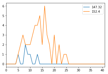
Make a plot with:
- column 3
- column 5
Details about the data available here.
df.plot(y=[3,5]);
Equations are not so great…
$\alpha = \frac{d}{dx}e^{-x}$
Attempt to include a picture from another location (looks great in original notebook):
Attempt to include a picture via drag and drop:

Written on April 8, 2017